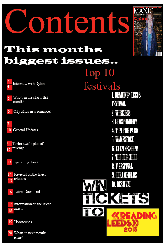
1.
In what ways does your media product use, develop or challenge forms
and conventions of real media products?
1.
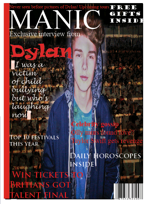
In what ways does your media product use, develop or challenge forms
and conventions of real media products? In my magazine, I have used features that are conventional to a magazine. I have placed my main image in the center of the page and have several different cover lines around it that are in different colours and font. My main cover line is larger than the others and in different font. I also placed my main masterhead at the top of the page, where it is essentially located.
2. How does your media product represent particular social groups ?
The social group I was particularly focusing on was aged between 14-20. Focusing on both genders but more specifically female as some of the free gifts included was make-up. I wanted to create an RnB magazine for my target audience, I achieved this by choosing a bright and popular colour scheme that represents cool, RnB conventions. I interviewed a male artist but chose questions that would interest both genders of my target audience. Commonly my targeted social groups would wear clothing that is quite bright and 'outgoing'. Examples of this being: Tight fitted jeans, air maxes and hoodies, I represented this in my magazine by dressing my artist similar to this.
3. What kind of media institution might distribute your media product and why?
4. Who would be the audience for your media product?
The audience that I would target my media product to would be aged between 14 and 20 and listen to RnB music, which is currently very big in the music industry. The standard artist that they would listen to are Beyonce, Ne yo, Usher, Alicia Keys, Olly Murs and Pitbull. Typically the audience would wear bright, original clothes to follow the trends of their idols.
I would target it for both genders however focusing more on females as I chose to include free gifts that consist of make-up and nail varnish, I also chose to use a male artist that spoke about his love life to appeal to females and make them buy the magazine.
5. How did you attract/address your audience?
My magazine was influenced by Vibe, I tried to make my magazine similar to this as when researching RnB music magazine this was the main one that came up. By following similar conventions I was hoping that my magazine would appeal to audiences that read Vibe. I used the same colour scheme, the simple but bold masterhead and very few cover lines around the main image of the artist that is located in the center. Another aspect I chose to use is the eye contact with the buyer, both artist on the magazine are using direct contact with the camera. As I chose to use these similar conventions I was hoping that my magazine would appeal to a similar audience that buy Vibe as I based the content of my magazine the same as Vibe.
Here are pictures of the magazine that I created in comparison to Vibe a professional music magazine.


The same colour scheme red, black and white has been used. The main artists name in bold red letters next to the image and the short cover lines around the artist.
6. What have you learnt about technologies from the process of constructing this product?
Whilst I was creating my music magazine, I learnt a great amount about
technologies and they have helped me in several different ways and by using them it ensured me to improve my magazine. To make the magazine I used several different
technologies, most of these being used on a computer such as Adobe Indesign CS4, Adobe photo shop, Internet explorer and finally a camera.
Adobe Indesign CS4 is a desktop publishing software application that allows you to create magazines, posters, flyers, newspapers, brochures and books. Indesign was the most challenging software that I had to use as I had never used it before and was unfamiliar with the different symbols. One of the main things I learned from Indesign was how to make the whole image fit into the box, as when I had cropped the image by making it larger or smaller the image wouldn't move so you had to select 'fitting' and then 'fit content to frame' to ensure that the whole image would appear in the box.
Adobe Photoshop is a graphics editing
program that allows you to edit photos, it helped me a great deal as I
was able to make changes and developments to my media product that
wouldn't of fitted in if I hadn't made these changes. A huge change that
I made was making my main image transparent, this allowed me to put a
background behind the image and I was also able to put cover lines in front of the image.
I used the camera on my phone to take all of my pictures that I needed, unfortunately the quality wasn't as good as it would of been on a digital camera but by using my phone it allowed me to quickly send the pictures to the computer and beginning editing. The camera on my phone has several different effects that were used to create different moods for the magazine. It also has a flash which allowed me to take some pictures at night time that made the background darker than the model which made it look like there was a spot light or glow around the model.
Overall technology helped me to create a front cover, contents page and double page spread for my music magazine, if I was unable to use any of these technologies then my final product would of been to a much lower standard and shown in a unorganized way.
7. Looking back at your preliminary task (the school magazine), what do you feel you have learnt in the progression from it to full product?
Since creating my school magazine my understanding of how to use Indesign has increased considerably as I know now how to bring certain text forward in front of an image or a background, I also know how to make to the whole image fit into the box if I have made it larger or smaller rather than just half of the image being shown. Another progression that I have achieved is how to layer images on Photoshop and how to crop around them and make them transparent, this makes it easy to insert them to Indesign as I can add the background or text to the image. Over all my understanding of these software's has increased majorly as I feel that I created a professional looking music magazine.