
Showing posts with label Construction. Show all posts
Showing posts with label Construction. Show all posts
Thursday, 14 February 2013

Wednesday, 13 February 2013
Ipad
 |
Our magazine is so popular that we have to create a mobile website for people to access when they are travelling. If they cant buy the magazine in store then they can access it on the Internet either on there Ipad or Iphone through our magazine app.
Friday, 1 February 2013
Front cover


This is my front cover of my music magazine so far. After looking back at it several times I have decided that I need to include a 'Top Chart' or 'Latest Album' as it looks more like a reading/gossip magazine than a music magazine.
I decided to add a picture of a crowd at reading festival to make it look more like a music magazine. I faded the people out so it didnt draw the attention from the main artist. I also added a glow around the artist to make him stand out even more.
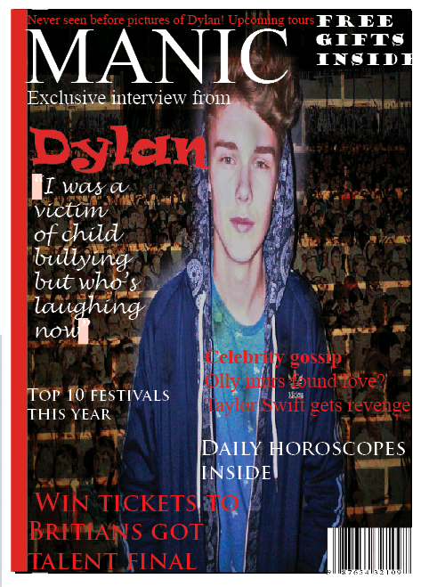
I added several more cover lines to my magazine to ensure that my target audience was able to see that there was going to be more than one exclusive interview inside.
Photoshot


Tuesday, 11 December 2012
Final font for my front cover


Once I had decided on the font I was going to use, I added a faded affect to make it stand out even more and not look like a dull normal font.
Thursday, 6 December 2012
Fonts for the mainheading

I also need to decide what the colour of my font is going to be, either red, black or white. The background of my magazine is going to be white so the font will be red or black which are bright colours that stand out.
My favourite fonts are the fourth one and the last one although the fourth one is bold and harsh which was the most popular answer on my questionnaire.
Subscribe to:
Posts (Atom)