

This is my front cover of my music magazine so far. After looking back at it several times I have decided that I need to include a 'Top Chart' or 'Latest Album' as it looks more like a reading/gossip magazine than a music magazine.
I decided to add a picture of a crowd at reading festival to make it look more like a music magazine. I faded the people out so it didnt draw the attention from the main artist. I also added a glow around the artist to make him stand out even more.
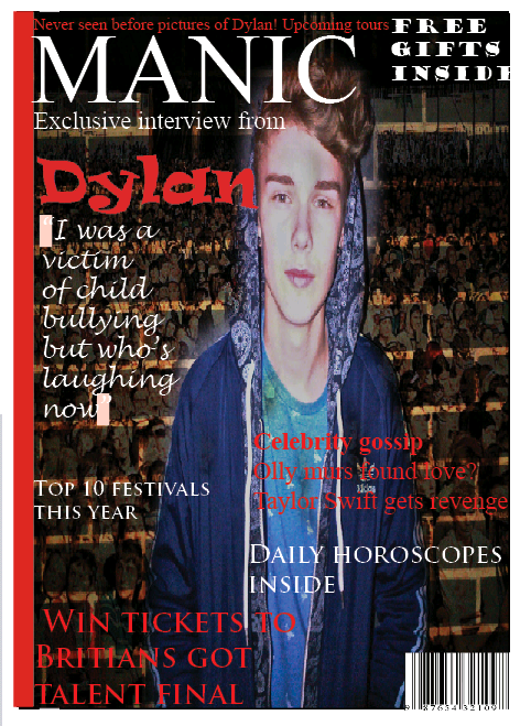
I added several more cover lines to my magazine to ensure that my target audience was able to see that there was going to be more than one exclusive interview inside.
I'm not sure how the crowd scene makes this more like a magazine cover? It's not a convention I'm familiar with - do you have examples of existing magazines which use this convention?
ReplyDeleteYour cover still feels rather unfinished - do you have a justification for only having one cover line and your choice of font for this?