Sunday, 24 February 2013

Evaluation

1. In what ways does your media product use, develop or challenge forms and conventions of real media products?
In my magazine, I have used features that are conventional to a magazine. I have placed my main image in the center of the page and have several different cover lines around it that are in different colours and font. My main cover line is larger than the others and in different font. I also placed my main masterhead at the top of the page, where it is essentially located. 


2. How does your media product represent particular social groups ?
The social group I was particularly focusing on was aged between 14-20. Focusing on both genders but more specifically female as some of the free gifts included was make-up. I wanted to create an RnB magazine for my target audience, I achieved this by choosing a bright and popular colour scheme that represents cool, RnB conventions. I interviewed a male artist but chose questions that would interest both genders of my target audience. 
Commonly my targeted social groups would wear clothing that is quite bright and 'outgoing'. Examples of this being: Tight fitted jeans, air maxes and hoodies, I represented this in my magazine by dressing my artist similar to this. 


3. What kind of media institution might distribute your media product and why?
http://prezi.com/wxa7tkooxxir/untitled-prezi/?kw=view-wxa7tkooxxir&rc=ref-32495693


4. Who would be the audience for your media product?

The audience that I would target my media product to would be aged between 14 and 20 and listen to RnB music, which is currently very big in the music industry. The standard artist that they would listen to are Beyonce, Ne yo, Usher, Alicia Keys, Olly Murs and Pitbull. Typically the audience would wear bright, original clothes to follow the trends of their idols.
 I would target it for both genders however focusing more on females as I chose to include free gifts that consist of make-up and nail varnish, I also chose to use a male artist that spoke about his love life to appeal to females and make them buy the magazine.

5. How did you attract/address your audience?

 My magazine was influenced by Vibe, I tried to make my magazine similar to this as when researching RnB music magazine this was the main one that came up. By following similar conventions I was hoping that my magazine would appeal to audiences that read Vibe. I used the same colour scheme, the simple but bold masterhead and very few cover lines around the main image of the artist that is located in the center. Another aspect I chose to use is the eye contact with the buyer, both artist on the magazine are using direct contact with the camera. As I chose to use these similar conventions I was hoping that my magazine would appeal to a similar audience that buy Vibe as I based the content of my magazine the same as Vibe.
 

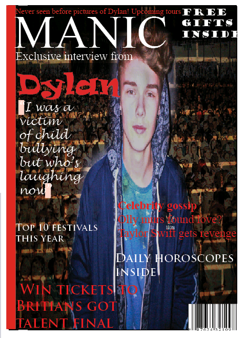
Here are pictures of the magazine that I created in comparison to Vibe a professional music magazine.   


 The same colour scheme red, black and white has been used. The main artists name in bold red letters next to the image and the short cover lines around the artist.


6. What have you learnt about technologies from the process of constructing this product? 
Whilst I was creating my music magazine, I learnt a great amount about technologies and they have helped me in several different ways and by using them it ensured me to improve my magazine. To make the magazine I used several different technologies, most of these being used on a computer such as Adobe Indesign CS4, Adobe photo shop, Internet explorer and finally a camera.

 Adobe Indesign CS4 is a desktop publishing software application that allows you to create magazines, posters, flyers, newspapers, brochures and books. Indesign was the most challenging software that I had to use as I had never used it before and was unfamiliar with the different symbols. One of the main things I learned from Indesign was how to make the whole image fit into the box, as when I had cropped the image by making it larger or smaller the image wouldn't move so you had to select 'fitting' and then 'fit content to frame' to ensure that the whole image would appear in the box.

Adobe Photoshop is a graphics editing program that allows you to edit photos, it helped me a great deal as I was able to make changes and developments to my media product that wouldn't of fitted in if I hadn't made these changes. A huge change that I made was making my main image transparent, this allowed me to put a background behind the image and I was also able to put cover lines in front of the image. 

The internet was the most helpful software during the whole project as I had to do a great amount of research before beginning anything else and the most important part about using the internet was so that I was able to use blogger to document my work. Whilst I was researching the internet was highly useful as it allowed me to look at the different types of music magazines, the conventions of a magazines and lastly any general basic knowledge that I was unaware of.  By using blogger I was able to show all of my research that I had found out in a neat and clear way as if it was hand writing it wouldn't have been as easy to understand. I had previously never used blogger so I had to learn how to use it which took some time but I know now how to use it in the future. By adding labels to my post it allowed me to put them in the sections that were appropriate for that piece of work rather than being in the wrong order. As you are able to upload pictures and videos this made it easier to show the different stages of putting together your magazine.

I used the camera on my phone to take all of my pictures that I needed, unfortunately the quality wasn't as good as it would of been on a digital camera but by using my phone it allowed me to quickly send the pictures to the computer and beginning editing. The camera on my phone has several different effects that were used to create different moods for the magazine. It also has a flash which allowed me to take some pictures at night time that made the background darker than the model which made it look like there was a spot light or glow around the model.

Overall technology helped me to create a front cover, contents page and double page spread for my music magazine, if I was unable to use any of these technologies then my final product would of been to a much lower standard and shown in a unorganized way. 


7. Looking back at your preliminary task (the school magazine), what do you feel you have learnt in the progression from it to full product?

Since creating my school magazine my understanding of how to use Indesign has increased considerably as I know now how to bring certain text forward in front of an image or a background, I also know how to make to the whole image fit into the box if I have made it larger or smaller rather than just half of the image being shown. Another progression that I have achieved is how to layer images on Photoshop and how to crop around them and make them transparent, this makes it easy to insert them to Indesign as I can add the background or text to the image. Over all my understanding of these software's has increased majorly as I feel that I created a professional looking music magazine. 

Thursday, 14 February 2013

What I will ask in my double page spread

Double page spread questions:

On my questionnaire I asked what questions they would like to see my artist answer on the double page spread. The questions were:

So what has your last relationship taught you?
Are you with someone at the moment?
Did you ever think you would become this famous?
Are you still able to do the things you want to do without being crowded by people?
Who encourage you to fill full your dream?
How does your family cope with you being famous?

Double page spread


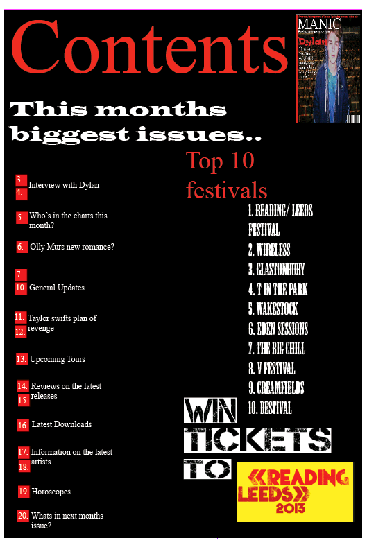
Contents page


Wednesday, 13 February 2013

Ipad


Our magazine is so popular that we have to create a mobile website for people to access when they are travelling. If they cant buy the magazine in store then they can access it on the Internet either on there Ipad or Iphone through our magazine app.


Friday, 1 February 2013

Front cover


This is my front cover of my music magazine so far. After looking back at it several times I have decided that I need to include a 'Top Chart' or 'Latest Album' as it looks more like a reading/gossip magazine than a music magazine.


I decided to add a picture of a crowd at reading festival to make it look more like a music magazine. I faded the people out so it didnt draw the attention from the main artist. I also added a glow around the artist to make him stand out even more.


I added several more cover lines to my magazine to ensure that my target audience was able to see that there was going to be more than one exclusive interview inside.

Photoshot

 This picture that I took will be on the front cover of my magazine with the artist name above it and straplines around it. I choose to take the picture with a brick background to add a R&B effect, however I think that I will edit around the picture and make it transparent.
When taking this picture I thought that I could use it on the double page spread as it is a full picture showing the whole artist body.


Friday, 14 December 2012

Template for the front cover


This is a template for the front cover on my music magazine. The font is currently black, I think it stands out and contrast well with the red background however I think it would look better without the white background around the writing. I have chosen to use one main image on my front cover and use several over images on my contents page and double page spread. I am going to take my picture on a plain white background so I can edit a colour around it if I need to although most of the music magazines I researched had white or grey backgrounds. The colour scheme that my target audience chose was Red, White and Black so I need to make sure that I include these colours. The artist name needs to be a vibrant colour so it stands out to the audience and makes them buy the magazine.

Tuesday, 11 December 2012

Final font for my front cover

After looking back to the previous fonts that I had selected, I decided that none of them fitted in with the R&B genre this was because they were not bold and harsh enough. I am still undecided on what colour I want the font to be but what ever I chose it needs to be bright and eye catching.


Once I had decided on the font I was going to use, I added a faded affect to make it stand out even more and not look like a dull normal font.


Thursday, 6 December 2012

Fonts for the mainheading

I chose to get a different variety of styles of writing as I couldn't decided what one I preferred. After looking back to my questionnaire analysis the most popular style of writing was bold and harsh so I will consider this when making my final decision on the font. I also need to make sure that the writing is easy to read and stands out from the other magazines.

I also need to decide what the colour of my font is going to be, either red, black or white. The background of my magazine is going to be white so the font will be red or black which are bright colours that stand out.

My favourite fonts are the fourth one and the last one although the fourth one is bold and harsh which was the most popular answer on my questionnaire.

Tuesday, 4 December 2012

Layout for photoshot

The location of my music magazine will be in the photography room as it has a very simple plain white background and once I have taken my photo I can edit a background in if I need to or keep it white like 'VIBE'.

My model for my music magazine is going to be a male, he is roughly 6ft and comes from London. He has curly hair with green colour eyes. He has a small built body which would fit in well with my genre. I have chosen to use the genre R&B therefore I want my model to be wearing a coat with a silver or gold chain round their neck with jeans and blazers (trainers) to portray that they are a rapper.

The positioning of my model would be direct address to the camera with serious facial expressions. After looking at several different R&B music magazines all the artist on the front cover have serious facial expression or seductive facial expressions.

Picture of my model -


Friday, 30 November 2012

Backgrounds on music magazine

I have been looking at several different R&B music magazines and I have discovered that all of the backgrounds are very plain and simple to make the artist stand out even more as they wear bright coloured clothes. 


On this music magazine the background is white and the artist is wearing black to show the contrast between the two colours, the main headline and straplines have also been written in red which also contrast with the colours white and black. From this information I know to use a plain simple background to make the same effective.


On this music magazine the background is grey which is a dull boring colour however the artist is wearing a grey jumper with a blue collar which makes him stand out. The colour scheme is the same throughout as the colours grey and blue have been used, the main headline is writing in blue to contrast with the artist blue collar. All of the strap lines have been writing in pink to make them even more eye catching.

Tuesday, 27 November 2012

Further research for music magazines

I decided to do a little research and then create my questionnaire based on what I had found, from this I then analysed my results and I now know what my target audience have chosen so I can research my genre in a lot more detail.


'VIBE' is the ultimate R&B music magazine therefore I will analyse it in great detail to insure that my music magazine portrays the genre of R&B. The theme of the colour orange has been used throughout even the artist hair is orange. The colour scheme of my music magazine is red, white and black, I could use the colour red for all the writing to create the same effect. The straplines look affective as they have been writing in black and white and stand out from the orange therefore I will insure that I use different colours for my main headlines and straplines. The fact that artist is wearing a crown suggest that she is high up in the industry and looked up upon. The shot that has been taken is a middle shot, most of the shots on 'VIBE' are middle shots or face shots there are never any full body shots so I will make mine a face shot or middle shot. The facial expressions are minimal as the artist is not smiling or showing another expression, however the artist is making eye contact with the camera to show a connection with the audience.

Thursday, 22 November 2012

Conventions of a music magazine

A MasterHead : The title is normally wrote with typography to make the readers become familiar with what magazine they are reading.
Main Image : Typically consisting of a leading artist or band within the music genre of the magazine.

Keylight : Usually highlighting the main artist or featured lines, (Coming from the left hand side onto the right).

Strapline : Seen as an introductory headline below the main masthead, to give an insight to the magazine.

Top and bottom strip : These are the strips below and above the magazine that give more information to what may be included in the magazine. Mostly being what draws the audiences attention.

Pug : ‘The ears of the magazine’, can either be at the top left or right-hand corners of the front cover. The prices of the paper, the logo or a promotion are positioned there or even a freebie is placed there to catch the reader’s eye.


Coverlines :  The essential articles inside the magazine are stated through sell lines, these are regularly seen at the right hand side of the cover.

Left Third : The left third contains the main feature article which is normally an exclusive interview on the artist or band as this is the core part of what may be inside the magazine.

Barcode/ Dateline & Price : A dateline is the date the magazine is published and the price is shown near the barcode or in the top right hand corner.

Friday, 16 November 2012

Anaylsis of my questionnaire

After handing out 15 questionnaires to my target audience age 14+ to both men and female for an R&B music magazine, the date I collected was :

The name of my music magazine will be Manic I was pleased about this is it was what I wanted my music magazine to be called. The colour scheme chosen was White, Red and Black, after researching several different music magazines this was the one that stood out and looked the most effective so I was pleased about that choice. Looking back to my questionnaire there was a clear order of the articles people wish to see :
-Charts
-Upcoming Tours
-Reviews of latest releases
-Upcoming Artist
-Latest Downloads
-News on artist
-Pull outs

Most of my target audience choose that they only wanted to pay £1.50 for my music magazine personal I think this is to cheap for a music magazine but it was the most popular answer so therefore that will be the price of my music magazine.

On the double page spreed the two most popular answers were an interview on the artist and tour pictures after thinking about this realistically I'm not going to take any tour pictures as I don't think they will look effective enough or real so therefore I will just use an interview on the artist for my double page spreed.

On my questionnaire I asked if there was a free gift in my music magazine would this convince you to buy the magazine all of my target audience ticked yes therefore my music magazine will have a free gift as it was a very popular answer.

Over half of the answers for the style of writing was BOLD and harsh, the other two options were italic and soft or Verdana as bold and harsh was such a popular answer I will use this style of writing on my music magazine.


Thursday, 15 November 2012

History on music magazines

The billboard

Billboard was founded in Cincinnati on November 1 in 1894, by William h. Originally titled Billboard Advertising it was a trade paper for the bill posting industry, hence the magazine's name.Within a few years of its founding, it began to carry news of outdoor amusements, a major consumer of billboard space. The magazine began coverage of motion pictures in 1909 and of radio in the 1920s. Billboard is an international news weekly magazine faithful to music and the music industry, and is one of the oldest trade magazines in the world as it was first published in 1896 two years after it was first found.


From 1896 to 2012 Billboard has changed considerably from the text to the images used, the style of writing has changed as it is now bolder and clearer to read. The image used has gone from a pixie to a artist in the charts which makes it seem more like a music magazine rather than a normal magazine or book. However the colour red has stayed the same throughout the years.


Wednesday, 14 November 2012

Questionnaire Analysis

The most popular name that my target audience choose was Manic.


White, Red and Black was the most popular answer to the colour schemes.


The most popular articles that my target audience chose were Charts, Upcoming Tours and Reviews of the latest releases.


The most popular answer for the cost of my magazine was £1.50 therefore I will use this price although it is very cheap for a music magazine.


On my double page spreed I will include a interview on the artist with a few tour pictures as they were the most popular answers.


Most of my target audience choose yes for a free gift most of the suggestions were a toy, lip gloss, C-D single, nail varnish and eye shadow.

The most popular style of writing chosen was BOLD and harsh as it will stand out and draw my target audiences attention.

Questionnaire


Music Magazine Questionnaire.

My music magazine is aimed at teens aged 14+, the genre of the magazine is r&b.


What names do you like for the music magazine?

1. SMILE :D

2.Gizmo

3.Manic

4.Pluss


What colour schemes do you like the most?

1. White, Red & Black

2. Light blue, Yellow & Black

3. Purple, Light green & Black

4. Pink, Yellow, Blue


What articles would you want to see?

1. Charts

2. Pull outs

3. News on artists etc…

4. Reviews of latest releases

5. Upcoming Tours

6. Upcoming Artists

7. Latest Downloads

8. Other __________________


This magazine will be released on a monthly bases therefore how much will you be willing to pay?

1. £1.50

2. £2.50

3. £3.00

4. £3.50


What would you like to see on a double page spread?

1. Interview with band/artist.

2. Fact file.

3. Tour pictures.

4. Latest Music video pictures + information.

5.History of releases to date and forthcoming new releases

6. Tour dates.

7. Other ______________


Would a free gift encourage you to buy the magazine?

1. Yes

2. No


If so, what would you like?

_____________________


What style of font would you prefer?

1. Bold and Harsh

2. Italic and Soft

3. Verdana

Tuesday, 13 November 2012

Magazine Covers

The colour red has been used throughout the front cover as the artists is wearing a red hat and the background around the text is also red. The white writing is really affective on the red background as it is easy to read and catches the audiences eye. You immediately know that the genre of this magazine is 'hip-hop' or 'rap' as the other artists featured on the front cover are all rappers, also the main artists Lil Wayne is posing like a gangster. The sky line gives the affect that the artists is mixing steroids with music which makes the audience interested and want to purchase it. The style of font has been kept very similar throughout to keep the theme the same, the title is big and bold which draws your attention to look at it. The artists name is also bold so the audience is aware who the artist is.


The colours that have been used work really well together, the filled a and d also look really effective and the colours contrast together.
The theme of the colours black, white and grey look affective as it makes the artist stand out even more. The style of the writing is very simple and is used throughout the front cover, the colour of the writing is black which seems to be a dull colour but stands out on the grey background which will catch the audiences attention. The artists hair also stand out from the dull background as it it bright and very unique as we all know that Lady Gaga has the bow in her hair. The picture of the artists suggest that she is willing to reveal all about herself as she is pulling her top down, it could also show that she is quite sexual.


Friday, 9 November 2012

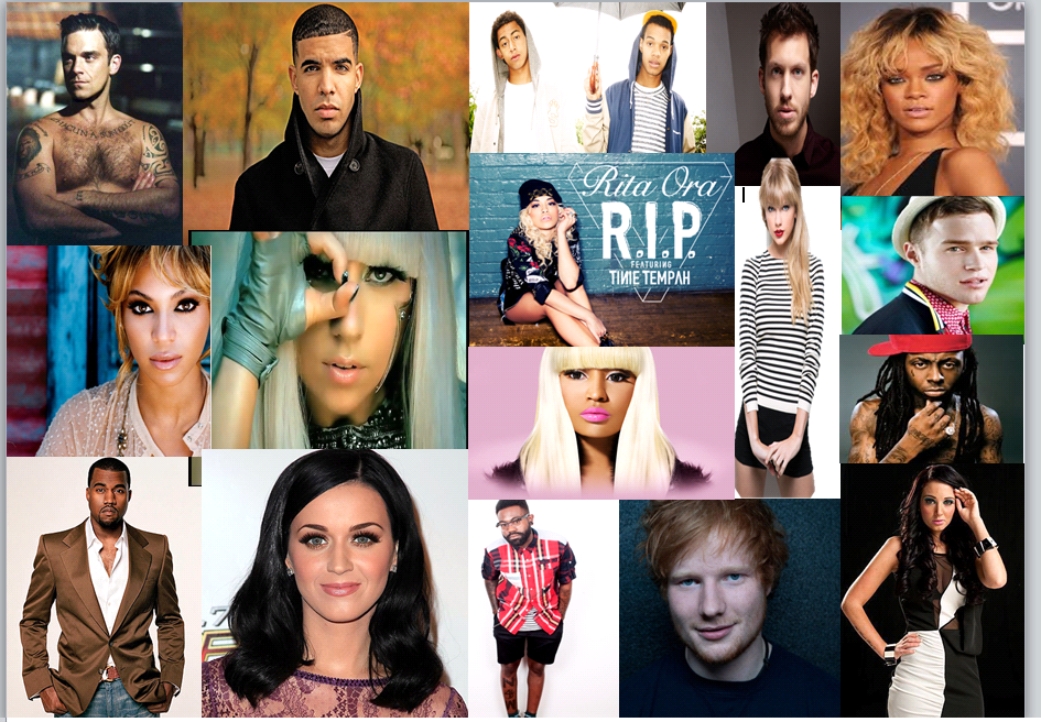
Mood Board


When I was creating my mood board I realised that most of the artists all have their own certain glamour factor. Most of the women are posing sexual we know this as the way they are standing and the eye contact they are making with the camera. The men are also posing quite sexual towards the camera as two of them have no tops on. Most of the artists have their own unique look which I will take into consideration when taking my pictures.